


Previous
Food Festivals in Italy: Autumn is the time to go!


Looking for the perfect color match at home is like looking for the Holy Grail: the quest lasts for centuries and is full of contradictory clues.
You may have never thought about it, but I can assure you that most of the white walls are left white for uncertainty and indecision more than for a question of convenience.
Because you have to match the decor, textiles, accessories...
Why complicate things, when you can simplify? The Latvian interior architecture agency Annvil decided to go back upstream, to focus on color and tackle it ... one floor at a time.
Located in the heart of Riga, the Redstone boutique hotel is a six-story project: two of them, where the St. Petrus restaurant is located, are decorated in black and white; the last four, with the suites, are are all designed in a monochromatic color scheme, from the armchairs to the bed's headboard, from the curtains to the door handle.
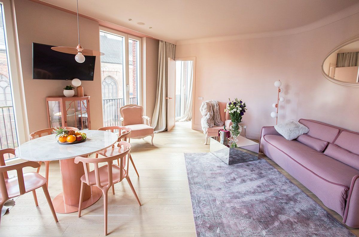 Pink walls for the fifth floor of the Redstone hotel
Annvil, that has long used color as a method to investigate the relationship between human beings and environment, has deployed the power of monochromatism at the Redstone hotel. On the one hand, the choice of a single color for walls and furniture gives a strong sense of identity to the room and pleases the eye while, on the other hand, creating a sort of relaxing neutrality.
A monochromatic interior, however, is anything but flat.
It is an invitation to play with different degrees of saturation and to find its balance: the most intense nuance of a chest of drawers becomes the decorative accent that gives depth to the room.
If the sixth floor is dedicated to the pale shades of Nordic blue, the fourth is a triumph of pink and looks like a hommage to Wes Anderson.
Both colors are considered unisex and it's not by chance that you have seen their pastel versions paired in Pantone Color of the Year 2016. These nuances promote a feeling of well-being and instill a sense of security: therefore, they are the ideal solution for hotel rooms as well as for your home, because they will make you want to come back again and again.
 The Redstone monochromatic hotel in Riga
The third floor of the Redstone hotel is a tribute to the sea foam of the Baltic sea, the fifth is a minimalistic milky white.
However, 'neutral' does not necessarily rhyme with white: dove gray and ivory are an elegant version of the Scandinavian color palette you love so much.
From walls to fabrics, these two colors have the potential to match both a classic and a modern style. And above all, they amplify brightness and emphasize details: it's time to dust off that brass accessory you've inherited.
 Taupe color for walls and interiors, inspired by the Redstone hotel in Riga

