Previous
Spring Detox: 3 tips to get back in shape


As you can tell looking at the latest collections by international design brands (and browsing your Instagram feed), the supremacy of Scandinavian aesthetics, with its love for monochromatic and linear design, has come to an end.
Everyone is getting jiggy with the colour vibe.
The final result is audacious and strategically unexpected. This is what your guests will think: in fact, the colours of your decor will have been strategically designed and matched, according to an art that - finally - leaves room for experimentation.
Why not go for an orange, green and blue bedroom? You just know have to calibrate colour intensity. Cinnamon, olive and a Prussian purple wall: it is not a recipe but an impressive complimentary color scheme.
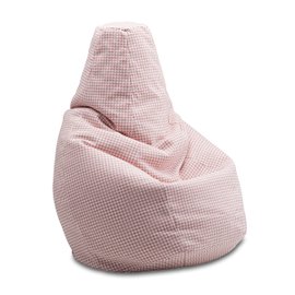
If you’re not the one to dare, don’t worry: you can go for neutrals. To add some spiciness, just choose more intense shades, such as sage or earthenware (which goes very well with apricot).
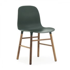
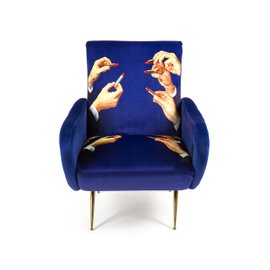
There’s no need to repaint the whole house or pull out any padding that comes under fire to undergo the charm of the colors. A colour combination can also be enhanced through textures. Velvet and rattan, but also embossed metals: use them to highlight small accents of different colors, in gradation or in contrast with each other.
Planning your own colour schemes is easy once you understand the principles of colour. We’re going back to school to learn a bit about the theory of colour: do you remember the colour wheel?
It is interior designers’ secret weapon.
The colour wheel provides a visual representation of which hues blend nicely together. The classic colour wheel is made up of 12 colours. However, in theory, it could be expanded to include an infinite number of shades. The colors that lie along the same axis, but opposite to the center of the circle, are considered complementary.
Technically, according to the color circle, it’s orange and blue. But the combination of red and blue is an ode to elegance that you just can not get away from.
Brick or cherry-red, light or deep blue: carefully choose the nuances and shades of these two colors, to get the fresh effect of a house overlooking the Mediterranean or the sought-after look of an Oxford professor’s personal library.
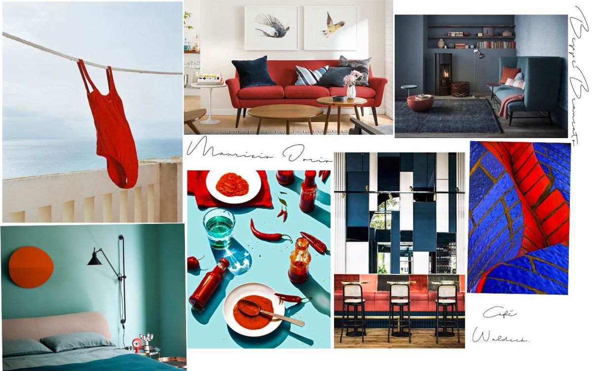
This combination is a dramatic statement, the perfect match for the most adventurous ones and for those who are not afraid to amaze their mother-in-law.
Yellow and purple are very elegant shades if declined in amber and amethyst, powerful and energizing if you choose violet and saffron instead.

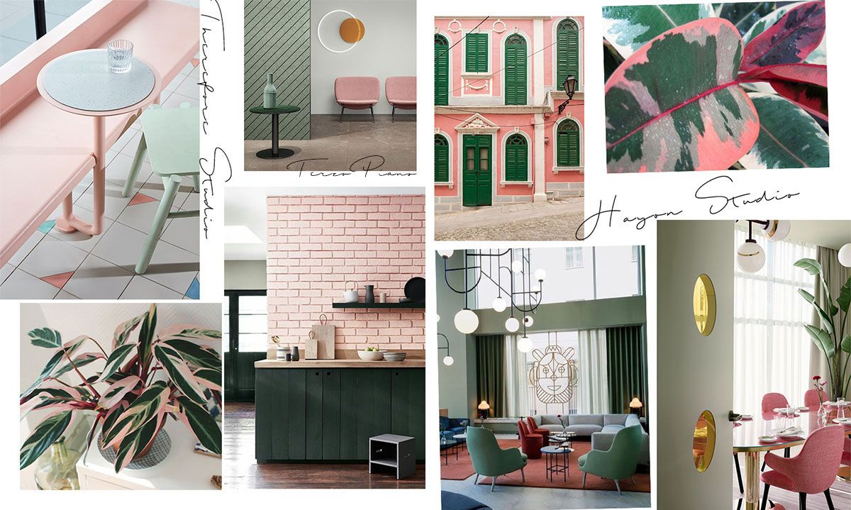
Millenial Pink and Greenery are the colours of a generation, two hues that provide a place for your eye to rest.
The California-style inspiration is very strong in this palette, but you only need to desaturate the two colors to obtain a more sophisticated, Scandinavian version.